Pantone Color Proofing for Luxury Paper Boxes
Turn the guidance into a production brief
Send your product size, quantity, destination and target date for a structured packaging recommendation and quote.
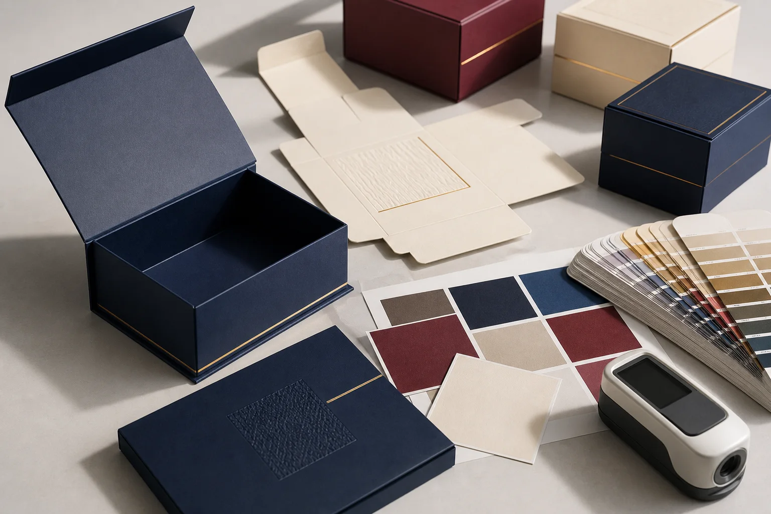
Luxury Paper Box Color Management: Pantone, CMYK, and Proofing That Protects Brand Consistency
Color is one of the first signals a customer reads when a custom paper box enters the room. A deep navy can suggest quiet authority, a warm ivory can make a product feel considered, and a saturated burgundy can create an unmistakable seasonal cue. In a digital mockup, those decisions look simple. On a production line, color is a system involving substrate, ink, coating, light, drying, measurement, and human approval. Treating it as a single value copied from a screen is one of the fastest ways to create expensive rework.
This guide is for brand owners, packaging buyers, designers, and quality teams who need repeatable color on luxury paper boxes. It explains how to choose a reference, when to use spot ink or process printing, why coated and uncoated stocks behave differently, how drawdowns and press proofs work, and how to write a purchase specification that can be checked across production lots. The goal is not a perfect screen match. The goal is a physical result that looks intentional under the lighting where the box will be handled, photographed, stored, and sold.
Why Color Changes Between Screen and Paper
Screens emit light. Printed paper reflects light. That fundamental difference means a luminous on-screen blue can appear darker, greyer, or more violet after ink is absorbed into paper fibers. A monitor also has its own brightness, white point, calibration, and ambient reflection. Two team members can review the same file and see different colors before the printer has even opened it.
Paper adds another variable. A bright coated sheet provides a smooth, reflective surface that holds ink near the top. An uncoated or textured sheet lets ink settle into the fibers, softening edges and lowering apparent saturation. Recycled fibers may have a warm base tone. Black board covered with a thin color layer can change a burgundy into a muted wine. The reference color must therefore be chosen with the intended stock and finish in mind.
Finishing changes the reading again. A soft-touch coating reduces glare and can make a color look deeper. A high-gloss varnish increases specular reflection and may make a dark field appear richer under a spotlight. Metallic foil reflects the surrounding environment, so the same gold can look champagne in daylight and bronze under warm retail lamps. Embossing creates highlights and shadows that alter perceived density even when the ink formula is unchanged.
The Practical Meaning of a Color Reference
A color reference is a physical target, not merely a number in artwork. The most useful target is a swatch or drawdown produced on a substrate and with a coating close to the final package. A book printed on a different paper is still useful for communication, but it cannot predict every production result. Keep the approved physical reference protected from direct sun, humidity, and abrasion, and record its edition or date so a replacement can be identified.
When a brand guide supplies a digital hexadecimal value, RGB value, or process build, treat it as a starting translation rather than a guarantee. Digital values describe a display or a color space. They do not specify paper whiteness, ink film thickness, varnish, or viewing light. Convert the brand intent into a physical target early, then use the screen for layout and visual direction.
For a new color, request a controlled set of swatches around the intended hue. A small step in cyan, magenta, yellow, black, or spot ink strength can be difficult to predict on a monitor but obvious on paper. A fan of close variants lets the team select a target that remains attractive after drying and finishing. It also creates a record that can be used when a second supplier or later production lot is involved.
Choosing Spot Ink or Process Printing
Spot ink is mixed to a specified formula and printed as a dedicated color. It is often the stronger choice for a large, flat brand field, a signature ribbon color, or a small design with strict color recognition. The printer can control the ink as a separate station and compare it to a physical reference. Spot printing can add plate and setup cost, but that cost may be modest compared with scrapping a large run of boxes.
Process printing builds imagery from cyan, magenta, yellow, and black plates. It is efficient for photographs, gradients, and designs that already contain many colors. A process build can reproduce a broad range of visual content, but a single brand color may shift with press condition, paper, ink density, and conversion profile. Extended-gamut process systems can add more ink stations, yet they still require a defined target and a proofing plan.
Many packages use both methods: process printing for a product image and spot ink for the logo field or border. Specify which elements are critical and which may be judged by an approved visual standard. If a spot color will be converted to process to meet budget or equipment limits, approve a physical process swatch first. Never assume a software conversion will look identical on the chosen board.
Coated, Uncoated, and Textured Paper
The letter after a spot-color name is not a minor detail. A coated reference is intended for a smoother, brighter surface; an uncoated reference anticipates more absorption and a different visual response. If the box uses a textured linen, felt, or recycled wrap, neither reference may be an exact prediction. Ask the converter to print a drawdown or proof on the actual decorative paper, not only on a generic white sheet.
Board caliper and construction can also influence color. A white-lined rigid board may provide a clean ground, while a greyboard core covered with thin paper can show through at edges or thin coverage areas. A dark paper may require an opaque white underprint before the visible color is applied. That underprint can alter the apparent hue and increase registration requirements around fine type and foil.
Document the paper grade, surface, whiteness expectation, grain direction where relevant, and approved coating. If a mill substitutes an equivalent grade, require a new drawdown whenever the base tone or absorption changes materially. The substitution may be technically strong yet still move the brand color enough to be noticed beside an earlier run.
Building a Reliable Proofing Sequence
The safest sequence begins before final artwork. First, confirm the product family, board and wrap paper, printing method, finishing stack, and viewing environment. Second, create a color target with the printer. Third, review a structural white sample so the team can judge how folds, panels, and shadows affect the color field. Fourth, produce a contract-style proof or press sample that includes critical colors, imagery, small text, and finishing callouts.
A digital proof remains useful for checking content, dieline placement, overprint, and obvious layout errors. It is not a substitute for a physical color decision on a premium package. A hard proof or press sheet should be reviewed under a controlled light source and then under the real retail or studio light where possible. Sign and date the approved reference, and state whether approval covers color only or also registration, coating, foil, embossing, and construction.
For a large first run, consider a short production trial using the final machine, paper lot, ink, and coating. A trial reveals behavior that a desktop proof cannot: ink drying, blanket pressure, board feeding, foil adhesion, scoring cracks, and color across a large sheet. Use the trial to establish acceptable variation and to identify which checks belong at the start, middle, and end of production.
Drawdowns and What They Tell You
A drawdown is a small controlled application of ink or coating on a chosen substrate. It is valuable because it isolates color from most press variables. The supplier can show several ink strengths, underprint options, or coating combinations on one sheet. For a luxury box, ask for the drawdown on the final wrap paper or a material with the same tone and absorption.
Use drawdowns to answer focused questions. Does the forest green stay clean over an opaque white base? Does the burgundy become too brown under soft-touch coating? Does a pale blush disappear into an uncoated stock? Does a metallic foil need a different backing color? Record the formula, substrate, coating, drying condition, and side of the sheet. If a drawdown is cut into a small swatch, keep a larger control sheet for later comparison.
Drawdowns do not prove registration or machine-to-machine consistency. They are a target-setting tool. The production proof then shows how that target behaves at speed, across a full sheet, and beside other design elements. A clear handoff between these stages prevents the team from treating a small laboratory swatch as a guarantee of every finished box.
Managing Light and the Viewing Environment
Color decisions should be made under repeatable light. A neutral viewing booth with a controlled daylight source is ideal for approvals. If a booth is unavailable, agree on a consistent location, lamp type, color temperature, and surrounding wall color. Do not compare one sample under a cool office lamp with another under a warm shop light and call the difference a printing defect.
Metamerism occurs when two samples match under one light and separate under another because their spectral behavior differs. It can appear when a process build is compared with a spot ink, when fluorescent brighteners are present, or when a metallic foil is used. Check critical colors under at least two relevant lights, such as neutral daylight and the warm retail light used for the product display.
Photography introduces another layer. Camera exposure, white balance, lens filters, and retouching can make an approved box look different online. Photograph the physical control sample with a neutral color card and retain the untouched reference image. Marketing imagery can be styled, but the physical approval remains the authority for manufacturing.
Measurement Without Losing Human Judgment
Instrument readings add discipline when used correctly. A spectrophotometer can record reflectance and calculate a color difference between a production sample and a target. The result is useful only when measurement geometry, illuminant, observer setting, backing, sample orientation, and surface condition are consistent. A gloss-coated box can produce different readings if the instrument sees a highlight or a textured area.
Agree on an acceptance band before production. A general tolerance may be appropriate for a secondary panel, while a signature logo field may require a tighter range. The numeric limit should be paired with a visual standard because a small measured difference can be visible in one hue and unnoticed in another. If the customer, printer, and inspection team use different instruments or settings, align the method before comparing data.
Measure multiple locations and multiple sheets. Large flat areas can show ink density variation from one side of a sheet to the other. Textured papers can produce local variation. Record the sample number, location, instrument, operator, and result. Use the data to identify trends rather than to create a false sense of certainty from one measurement.
Registration, Trapping, and Fine Detail
Color can be correct while the package still looks wrong if plates are out of register. Fine type may show a colored halo, a border can become uneven, and a foil edge can appear to float. Define a registration tolerance for important elements and inspect at normal viewing distance as well as magnification. The best tolerance depends on the press, board, sheet size, and design complexity.
Trapping slightly overlaps neighboring colors to reduce white gaps caused by small movement between plates. Too little trap reveals the substrate; too much trap makes a small letter heavy or changes a narrow line. Ask the prepress team to explain the trapping plan for the actual board and printing method. Keep dieline, crease, and foil layers clearly named and separated from artwork so a production operator cannot accidentally print a technical mark.
Large dark fields deserve special attention. A rich black may use several process inks and can dry slowly or show scuffing. A dark navy built from process inks may shift toward purple if one plate is weak. Test rub resistance after the chosen coating and allow sufficient drying before packing. Color approval should include handling, folding, and the final inspection surface, not just a flat sheet.
Foil, Varnish, and Embossing Interactions
Foil is a reflective layer, not an ink. Its apparent color changes with viewing angle and the surrounding package. A warm gold foil over a dark navy can look very different from the same foil over burgundy. Request a finishing sample that includes the true foil, adhesive, paper, and coating. Check edge definition, pinholes, cracking at folds, and how the foil sits beside the printed color.
Varnish can be flood-coated or applied selectively. A spot gloss can make one color look more saturated simply by increasing reflection. A matte coating can reduce glare but may highlight scuffs or fingerprints. List the sequence of printing and finishing because a coating applied before foil can behave differently from one applied after it.
Embossing creates relief and shadow. A debossed logo may look darker at one angle even when the measured ink is unchanged. Review the assembled box, not only the flat sheet. The lid angle, corner geometry, and interior lining influence the light pattern customers see during opening.
Color Across Panels and Components
A rigid box may use a lid, base, drawer, card, ribbon, and paper bag produced on different equipment. A color that matches within each component can still look mismatched when the components are placed together. Make a component map listing every color-critical part, supplier, substrate, printing method, coating, and reference.
Ask for a side-by-side set of all components before mass production. Inspect the front panel, side walls, interior, and accessories under the same light. For a wraparound field, check the seam and corners where paper grain, adhesive, or stretching can change the visual density. For a gift set, check that inserts, tissue, and cards do not introduce a competing white or cream tone.
When several suppliers are involved, ship an approved control swatch to each one and require a first-off comparison. Do not rely on the same color name alone. The control should show the intended substrate and finish. Keep a master sample in a protected archive and a working sample at the factory; replace working samples when they are damaged or visibly faded.
Preventing Color Drift Between Production Lots
Color drift can come from a new paper lot, ink batch, blanket condition, press calibration, humidity, drying time, coating viscosity, or operator adjustment. A robust specification anticipates normal process variation rather than assuming every box will be identical. Define start-up approval, in-process checks, and final sampling. A signed first sheet should remain with the production record.
Inspect the first, middle, and last portions of a run. Compare large fields, small marks, foil, and coating under the agreed light. If a drift appears, isolate affected cartons and record the corrective action. Do not blend visibly different lots in one master carton or ship a mixed run without customer approval. Traceability turns a complaint into a contained investigation.
Storage matters after production. Keep finished boxes away from direct sun, heat, water, and high humidity. Avoid stacking pressure that marks a soft-touch surface. If boxes will wait for several weeks before filling, confirm that the coating has fully cured and that the storage environment matches the approved condition. A color that passes at the factory can be scuffed or dulled by careless handling later.
Writing the Purchase Specification
The purchase order should identify the physical reference, color system, substrate, printing process, coating, foil, viewing light, measurement method, acceptance range, registration expectation, and inspection plan. State whether the reference is for a flat sheet, assembled box, or both. Include photos only as supporting evidence; a screen image alone cannot replace the physical target.
For the structural package that carries the color program, compare our Custom Logo Gift Boxes, Custom Premium Packaging, and Custom Magnetic Gift Boxes. Teams still finalizing artwork can pair this guide with the Gift Boxes with Logo Guide and the Foam-Free Paper Insert Guide before requesting a production proof.
Add a change-control clause. A change in board mill, paper surface, ink supplier, press, coating, or finishing order requires notification and, when relevant, a new approval. Require the supplier to retain production samples and records for the agreed period. Define who pays for rework when a lot falls outside the approved standard, and define how an exception is documented.
Write the specification in language a production inspector can use. “Match the brand navy” is open to interpretation. “Compare the front panel to control sample CP-07 under neutral daylight and warm retail light; measure three locations after coating cure; hold any lot outside the agreed visual and numeric band” is actionable. Clarity protects both buyer and supplier.
A Practical Approval Workflow for Brand Teams
Assign one decision owner for color. Too many independent approvals can create contradictory feedback and late changes. The owner should collect comments from design, marketing, product, procurement, and quality, then issue one signed decision. Keep color feedback separate from copy edits and structural changes so a supplier knows which revision to make.
Use a simple sample naming convention that includes project, component, substrate, finish, and revision. Photograph the sample beside the reference under controlled light, but never use the photograph as the only approval record. Note whether the sample is wet, dry, coated, folded, or assembled. These details explain why an apparently small change may occur between stages.
Before release, conduct a final “opening scene” review. Place the finished box with the actual product, insert, tissue, and accessories. View it from the distance and angle a customer will use. Confirm that the color remains balanced when the lid is open, the product is removed, and the package is photographed. A color that wins on a flat proof but clashes with the full experience needs another iteration.
Common Cost Traps and Better Alternatives
The cheapest quote may omit a physical proof, use a generic paper, convert spot ink without approval, or treat all variation as acceptable. A slightly higher unit price for a controlled drawdown, press check, and documented first-off can reduce the total cost of ownership. Compare quotes at the same specification, including tooling, proofing, inspection, packaging of empty boxes, and replacement policy.
Another trap is choosing a complicated finishing stack before the base color is stable. Solve the paper and ink combination first, then add foil, varnish, or embossing. If the design requires a premium effect, test a simplified version beside the full version. The team can see whether the finish truly improves the package or merely hides an unstable color decision.
Short runs benefit from restraint. A carefully selected stock paper, one spot color, and a controlled coating may look more consistent than a complex process build printed across multiple suppliers. As volume grows, invest in dedicated references, measurement equipment, and a formal lot-control plan. The right level of control should match the commercial risk.
Supplier Questions Before You Approve a Color Program
Ask which presses and finishing lines will make the boxes, whether the same equipment will be used for repeat orders, and which parts are outsourced. Ask for examples printed on the proposed paper rather than unrelated products. Confirm whether the supplier can make drawdowns, hard proofs, production trials, and instrument readings, and whether the operator who signs off is trained in the agreed method.
Ask how paper lots, ink batches, humidity, drying, coating cure, and storage are controlled. Ask how nonconforming color is isolated and how a corrected lot is approved. Ask what happens when the selected spot color cannot be reproduced exactly on the chosen stock. A capable supplier will explain the tradeoff and offer a controlled alternative rather than promise an impossible screen match.
Finally, ask for a repeat-order plan. The color program should survive a new purchase order, a seasonal pause, a different delivery destination, and a new member of the buying team. Control samples, revision records, and a clear specification make continuity possible.
The Color Approval Checklist
Before production release, verify the following: the final product and package components; paper grade, surface, and base tone; spot or process printing choice; underprint requirements; ink and coating sequence; physical color target; drawdown or proof; viewing lights; measurement method; acceptance band; registration and trapping; foil and embossing sample; assembled-box review; start, middle, and end inspection; lot traceability; storage conditions; change-control rules; and signed control samples.
Confirm that the artwork file contains named layers for artwork, dieline, crease, foil, varnish, and technical marks. Confirm that overprint settings were checked on the output proof. Confirm that color-critical elements are identified in the purchase order. If the package includes a paper bag or card from another supplier, compare those parts together before approval.
The final question is simple: can another qualified inspector reach the same decision using the records provided? If the answer is no, the program still depends on memory or personal taste. Add the missing reference, light condition, measurement detail, or sample photograph, then issue a controlled revision.
Conclusion
Luxury paper box color is a physical manufacturing outcome, not a screen setting. The most dependable programs connect brand intent to a substrate-specific reference, select spot or process printing deliberately, prove the color with drawdowns and physical samples, inspect under controlled light, and record measurable acceptance criteria. Coatings, foil, embossing, folding, storage, and the surrounding product experience all belong in the approval conversation.
When buyers and suppliers share one physical target and one clear process, color stops being a late-stage argument. It becomes a repeatable part of packaging quality. That discipline protects launch dates, reduces reorders, and gives every box in a premium program the same confident presence from the first shipment to the next season.
Frequently Asked Questions
Should a luxury paper box use spot ink or process printing for its main brand color?
Spot ink is often the better starting point for a large, flat signature color because it can be mixed and checked against a physical target. Process printing may be appropriate for photographs, gradients, or a design already built around multiple process colors. The final choice depends on the paper, equipment, volume, and approved proof.
Is a digital proof enough to approve packaging color?
A digital proof is useful for artwork placement, text, and layout, but it cannot fully predict reflected light on paper. Approve critical color with a drawdown, hard proof, or production-representative sample on the intended substrate and finish.
Why does the same color look different on coated and uncoated paper?
Coated paper holds ink closer to a smooth reflective surface, while uncoated paper absorbs more ink into its fibers. The difference changes saturation, sharpness, and perceived darkness, so each surface needs its own physical reference.
How can a brand keep color consistent across repeat orders?
Retain a protected control sample, document the substrate and finishing stack, define viewing light and acceptance limits, inspect multiple points in each run, and require approval before material or process changes. Keep production samples and lot records for traceability.
Do foil and soft-touch coatings change the approved ink color?
They can change how light reflects from the surface and therefore change perceived color. Approve the printed color together with the actual foil, varnish, coating, paper, and assembled box whenever those finishes are part of the customer-facing design.